How to make a Sankey chart in seconds
The "where the money went" chart — revenue fanning out into costs and profit — looks like an afternoon in a design tool. It is a table with three columns. Type the rows into the chart builder and the chart draws itself as you go; then download it, or send it as a link that opens full screen. Everything below was made that way, in the browser, with nothing uploaded.
What a Sankey chart is
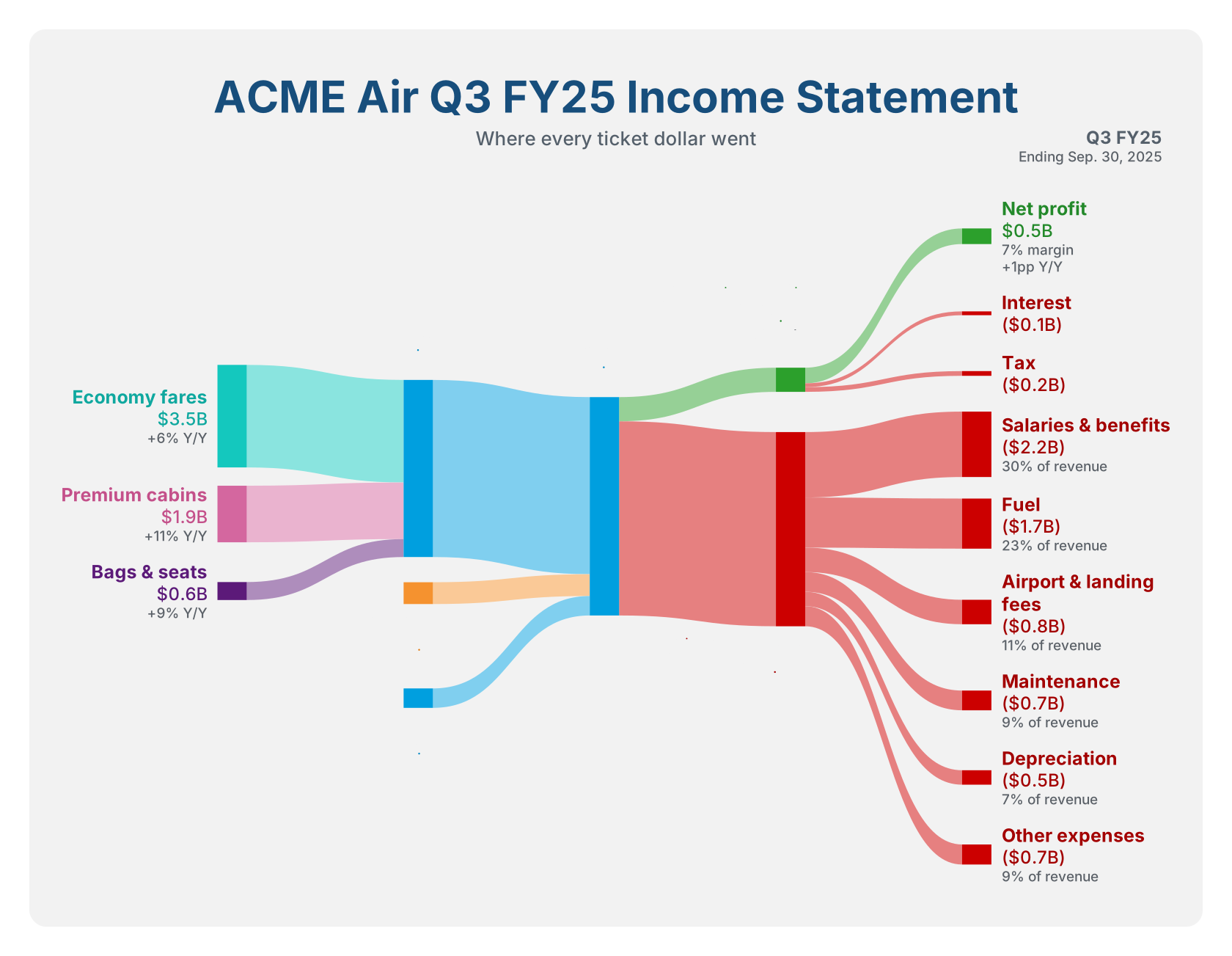
A Sankey chart draws quantities moving between things. Each thing is a node — a bar — and each movement is a flow, a band whose thickness is proportional to how much moves. Because the bands are to scale, the eye does the arithmetic: in the chart above you can see that fuel cost twice the quarter's operating profit without reading a single number. The form is named after Captain Matthew Sankey, who used it in 1898 to show where a steam engine's energy went.
It fits anything that splits, merges and adds up:
- An income statement — segments into revenue, revenue into costs and profit. The chart people most want, and the one this page builds.
- A budget — income into categories, categories into line items.
- Energy, materials, traffic — sources to uses, with the losses on show.
It does not fit numbers that do not add: averages, rates, percentages of different wholes. If the bands going into a node cannot sum to the bands coming out, a Sankey chart will still draw — and say something untrue.
The recipe, in five steps
- Open omniviewer.org/chart and pick Sankey. It opens on the finished example, because the second chart anyone builds is an edit of the first. Start blank clears it; Load example brings it back.
- Name it. A title, a one-line description under it (the place for "lower is better" or "where every dollar went"), and an optional corner note — its first line bold, the rest small, the usual home of the period.
- Type the flows. Each row is From → To → Value. Press Enter in a value to open the next row; node names autocomplete from the ones you have already used.
- Style it. A prefix and suffix for the numbers (
$andB), decimals, costs in accounting parentheses, flow thickness, a background, and an elevated card whose soft shadow is drawn into the image itself. - Take it away. Download PNG exports at twice the on-screen size, sharp on a slide or a retina screen; Download SVG is vector and scales to anything; Copy image puts a PNG on the clipboard; Copy link sends the chart itself.
The preview redraws on every keystroke, so there is no "generate" step to wait for. That is the "in seconds": the time it takes is the time it takes to type the numbers.
The data, row by row
This is the whole of the example. There is no separate list of nodes to declare: typing a name creates the node, and a name that appears both as a To and as a From becomes a column in the middle. Columns are worked out from the paths between nodes, and a source that feeds straight into revenue — the loyalty program, cargo — sits one column before it, beside passenger revenue, rather than stranded at the far left.
| From | To | Value ($B) |
|---|---|---|
| Economy fares | Passenger revenue | 3.48 |
| Premium cabins | Passenger revenue | 1.92 |
| Bags & seats | Passenger revenue | 0.61 |
| Passenger revenue | Revenue | 6.01 |
| Loyalty program | Revenue | 0.74 |
| Cargo | Revenue | 0.66 |
| Revenue | Operating profit | 0.82 |
| Revenue | Operating expenses | 6.59 |
| Operating profit | Net profit | 0.53 |
| Operating profit | Interest | 0.13 |
| Operating profit | Tax | 0.16 |
| Operating expenses | Salaries & benefits | 2.22 |
| Operating expenses | Fuel | 1.70 |
| Operating expenses | Airport & landing fees | 0.83 |
| Operating expenses | Maintenance | 0.67 |
| Operating expenses | Depreciation | 0.49 |
| Operating expenses | Other expenses | 0.68 |
Three things about the rows are worth knowing:
- Row order is vertical order. The flows leaving a node stack top to bottom in the order you typed them, which is why profit sits above expenses. The ↑ and ↓ beside each row move it.
- Notes go on nodes, not rows. Under Nodes — colours & notes every node has a note that prints under its value:
+8% Y/Y,11% margin,30% of revenue. Two lines are fine. - Type the figures you have, not rounded ones. The labels round to one decimal ($3.5B), but every band is drawn from what you typed (3.48), so the picture stays to scale. Round a dozen numbers by hand and the two sides of a node can stop agreeing — which the builder will point out.
Colours you don't have to pick
The look is the one income-statement charts usually wear: a light sheet, a heavy navy title, saturated bars, the bands at half strength, and every label in its node's colour. The colours are chosen for you from the names:
- Sources — the nodes nothing flows into — each get a hue of their own.
- Costs go red: anything named like costs, expenses, tax, losses or depreciation — and interest, fees or "other" when nothing in the name says profit. With Costs in parentheses on, their values print the accounting way,
($2.2B). - Profits go green: profit, income, earnings, EBITDA, margin.
- Everything else takes the colour of its biggest inflow — except that a subtotal fed by the sources comes out blue, rather than borrowing one segment's hue. That is why passenger revenue and revenue are both blue above.
A cost word beats a profit word, so Income tax is red — and Pre-tax profit stays green, because it names the line above the tax. Any node can be overridden from its swatch: a palette colour, a custom hex, or back to Auto.
Keeping it honest
A Sankey chart makes one promise — what goes into a node comes out of it — and nothing in the drawing enforces it. A node that takes in 6.01 and sends on 7.4 is drawn as a perfectly respectable bar. So the builder checks while you type, and lists what it finds under the rows:
- a node whose inflow and outflow differ by more than half a percent (sources and final destinations are exempt — that is what they are) — it is drawn at the larger of the two;
- a flow that would make a loop back to where it started — it is left out;
- a flow from a node to itself, or a row missing its source or its target;
- a value that is zero, negative, or not a number.
The chart still draws while a warning stands, so you can type a table in any order. The warnings are there for the moment before you export it.
Share it as a link that opens full screen
Copy link puts a link like this on your clipboard:
https://omniviewer.org/chart/view#chart=jZRvT9swEMa_imWNaRNR…&encoding=deflateWhoever opens it lands on the VIEW tab: the chart on its own, fitted to the window, with a Full screen button — or press F, or double-click the chart. It is the screen to present from, in a meeting or on a TV, and the same downloads are one click away. The BUILDER tab opens their own copy to change — and the address bar follows every edit, so it is always a link to the chart as it stands.
There is no account and no database behind that link, because the link is the
chart. The builder takes the chart's JSON — the same document its JSON tab shows
and Save .json writes, the words and style under metadata and the numbers
under data —
{
  "metadata": {
    "type": "sankey",
    "title": "ACME Air Q3 FY25 Income Statement",
    "description": "Where every ticket dollar went",
    …
    "colors": {},
    "notes": { "Operating profit": "11% margin\n+2pp Y/Y", … }
  },
  "data": [
    { "from": "Economy fares", "to": "Passenger revenue", "value": 3.48 },
    …
  ]
}
— compresses it with DEFLATE, the algorithm inside ZIP files, using the browser's own
CompressionStream, and writes it into the link as URL-safe base64. The whole
seventeen-row example comes to about 900 characters. It goes after the #, in the
part of a URL that browsers never send to the server: opening the link asks omniviewer.org for
/chart/view and nothing else, and the numbers are unpacked in the visitor's own tab.
Opening someone's link does not touch your own work. Their chart is shown, not saved; the chart you had is still there when you next open the builder without the link — unless you edit theirs, at which point it becomes yours, and Undo brings the old one back.
Questions
Is it free? Do I need an account?
Yes, and no. There is nothing to sign up for, and nothing to install.
Does my data leave my computer?
No. The chart is laid out and drawn by JavaScript in your browser, the PNG is rendered by your browser, and your work is kept in your browser's own storage. A link carries the data only to whoever you send it to.
Can I edit a chart later?
The builder keeps your chart between visits on the same browser. To move it to another machine, or keep versions, use Save .json and Open .json — or just keep the link.
Can it make other charts?
A pie or donut chart too, from the same builder: a label, a value and an optional note per slice. Each type keeps its own chart, so switching between them loses nothing.
What size is the PNG?
Twice the chart's own size — the example exports at 3360 × 2606 — so it stays sharp when a slide deck or a retina screen scales it. The SVG has no size at all; it is drawn fresh at whatever size it is shown.